Thursday, 24 July 2008

Developing the style

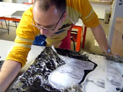
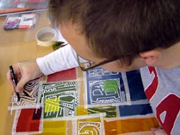
Here are a few more of the original sketchbook tests for the communication series. What started as a very rough sketch (top left) became gradually more complex and involved. The second image (top right) was where the final images were crystalised in my head. This image showed me how the colours could work in tandem with the text and also how the text could be broken up and altered to play with the legibility of the message. The remaining predominantly black and brown images were heavily influenced by the graffiti style of writing seen in the 'street sketchbook'. The addition of tin foil and gesso textures in the final pieces came from the yellow and purple abstracts I'd produced in my sketchbook straight after I had completed the teddy bear series. Work in progress for the communication series in the next post...

Sunday, 29 June 2008

error ready


The communication series started with a series of images in my sketchbook, playing around with how the layout of the text was going to work. I created simple word documents of text overlaid at different sizes, sticking this into my sketchbook. I then overworked the image with gesso (to add texture), coloured inks and watered down acrylic paint. When the page was dry I then overlaid thick PVA glue in simple, geometric and linear patterns. This dried clear over about 24 hours and left a cool, shiny trail across he work. The final stage in the preliminary images was to over-work elements of the now knocked-back text with biro. The idea for this came from the original Helvetica programme and the idea that the font was designed to be so highly communicative. I was keen to mess with this preconception of the font and to treat it in a completely opposite way, decomposing the message and altering its legibility. This was also in keeping with the idea of how technology removes elements of meaning and truth from modern communication. I was pleased with the results, although they lacked a little impact due to the brown paper backing (colours were deadened a little as a result). I then experimented further, playing around with the words I was using and how the text could work to relate more obviously to technology. I thought about syntax errors received as a child on my commodore 64 and the frustrations experienced as computers failed to deliver precisely what I was after. This led to the use of CTRL, ALT, DEL, and run-stop restore as themes within the pieces. I experimented with using text that had a pixelised quality, using squared pages in my sketchbook to construct old-school computer style text. I used a water soluble pen, which then had ink and glue dribbled over it. As a result, the wet medium mixed with the inks and created a really cool blurry effect, with colours within the pens separating out in a random way. Again this was effective in disguising the message. The experiments had once again galvanised me into action and I felt able to start experimenting on a larger scale. The first canvas was ready to be tackled...

Sunday, 27 April 2008

Me at Modern Art Oxford

It's been a while since my last post, but here I am last August, celebrating the culmination of my course standing in the Cafe at Modern Art Oxford in front of my completed work. Although the course did not progress beyond this point (at least, not as yet! - I still hold out hope that it may at some point), I was still hugely inspired to develop my work and already had a direction to go in. I happened upon a piece of art on E-bay whilst doing a bit of research to find out if I could sell my work on there. The piece was composed of rich brown tones and had a vein of silver leaf running through it. Purely abstract and simple but I was inspired enough to produce a couple of sketchbook homages which I felt turned out pretty well. (See image on left). My artwork went on hold for a bit whilst the new term at school took over but was reinvigorated once more by a documentary I saw on the BBC about the typeface Helvetica. As a designer, I have always had a passion for typography and the documentary provided an insight into this important font. What I found particularly interesting was the fact that Helvetica had been designed to create the ultimate in legibility, or at least, it had come to symbolise that quality. I was immediately gripped with the idea of using this font, but twisting and distorting it to obscure it's legibility, and rushed off to draw a little post-it note sketch for future reference. Almost at the same time, I had bought the 'Street Sketchbook' book, full of superb, contemporary art and illustration by Graffiti artists. I loved the way they mixed design and contemporary style and was again hugely inspired by the work I saw, wanting to create a similar, cool, contemporary thread within my work. To move me away from the whimsy of the Teddy Bears. The post-it sketch kept staring back at me every time I used my computer until I was moved to develop some initial experiments in my sketchbook. These acted as the grounding for the larger scale pieces I have since been working on ...

Tuesday, 28 August 2007

hold the front page

Well, I've just discovered that apparently my picture made the front page of the Oxford Times no less - very exciting! Haven't seen the paper but my hope is it may make the website, so i can at least suss out whether they caught my better side!! The presentation of our 'collective' work and Open evening are on Thursday, which I'm both nervous (for the presentation) and excited about. More press are coming I think, to talk to us about the work and about how the course has effected us, which is really exciting. Hopefully the presentation will be fab and running at a decent pace before then.
School starts back next week, so I've been busy getting my Art room straight and getting all the paperwork done I've been putting off until now. GCSE results were brill so it's all positive for the year ahead, fingers crossed!

Friday, 24 August 2007

Teddy bears' Nick Pic

So, the teddy bears are all up now in the Modern Art Oxford Cafe. I gave them the collective title of Teddy Bears' Nick Pic, a pun on the fact that the paintings are like the photo's taken of criminals in the 'nick'. It was great to finally get the work up on the wall, it finally felt like a proper event, the team at MAO were great in helping it to look as professional as possible. The Oxford Mail came in and took my picture with the bears but I don't know if I featured in the article or not (We don't get that paper round our way). Gill, another member of our 'collective', was featured and her work looked fab.
Work has been progressing full tilt on the final presentation now. With almost 3 days solid invested in putting it together and making it make sense (a difficulty with the way I waffle on...) I think I'm finally there. The presentation next Thursday marks the culmination of what has been a really inspiring year for my artistic development. It will also be the mark which decides our overall grading. More about that whenever I know...

Thursday, 16 August 2007


And so, with the work going up at Modern Art Oxford on Monday and the urgent need to get them framed buzzing about in the back of my head, a decision was made to go with the teddy bears. Although 5 have been made, the 4 square pieces are the ones which will be exhibited, as they work well together as a series. The larger piece will be staying at home, but can still be enjoyed by all as I've included it top left. It made sense to stick with these, as most of the development in my sketchbook had been based around the identikit idea. Also, the artists I had looked at and the research carried out all linked to this body of work. Although I still feel very happy with the way the portraits turned out, they lack the sense of unity which this work has. I also feel the humorous juxtaposition of the imagery will entice the public to look more closely at them. I've certainly had more fun with this work than in anything I've produced in a long time and in comparison the portraits are a little more po-faced perhaps. These are not taking themselves too seriously.

Wednesday, 15 August 2007

The end is nigh

I finally managed to finish the other portrait pieces begun way back around November time last year. These had sat upstairs in the spare room, discarded whilst I diverted my attention to the teddy images. I was really uncertain how I could turn them around, I was so unhappy with them at the beginning stage. But with a bit of perseverance I feel really pleased with the direction in which they have gone. I'm particularly pleased with the 2 larger pieces (the colour one posted yesterday and the black and white piece at the top left). These were so dark to begin with, I wasn't sure if they could be salvaged at all. But on looking back through my sketchbook I found inspiration, using gridded lines and boxes to fragment the face and interconnect the various elements of the pictures. The black and white image uses the same numbers as the colour image mentioned yesterday and works as a companion piece, the dark to the other pieces light. The 2 red pieces have been treated with a similar paint quality, simply over-working the original photographic image and breaking up the background to create a fractured quality. I think they represent the different facets of my personality very well, it's just a shame they probably wont be seen by a wider audience, as I think I'm likely to stick with the teddies for the display at Modern Art Oxford next week. Anyrate, I've put a poll in, so if you visit, please feel free to let me know which work you think is stronger. It will be interesting to hear your views.