Tuesday, 28 August 2007

hold the front page

Well, I've just discovered that apparently my picture made the front page of the Oxford Times no less - very exciting! Haven't seen the paper but my hope is it may make the website, so i can at least suss out whether they caught my better side!! The presentation of our 'collective' work and Open evening are on Thursday, which I'm both nervous (for the presentation) and excited about. More press are coming I think, to talk to us about the work and about how the course has effected us, which is really exciting. Hopefully the presentation will be fab and running at a decent pace before then.
School starts back next week, so I've been busy getting my Art room straight and getting all the paperwork done I've been putting off until now. GCSE results were brill so it's all positive for the year ahead, fingers crossed!

Friday, 24 August 2007

Teddy bears' Nick Pic

So, the teddy bears are all up now in the Modern Art Oxford Cafe. I gave them the collective title of Teddy Bears' Nick Pic, a pun on the fact that the paintings are like the photo's taken of criminals in the 'nick'. It was great to finally get the work up on the wall, it finally felt like a proper event, the team at MAO were great in helping it to look as professional as possible. The Oxford Mail came in and took my picture with the bears but I don't know if I featured in the article or not (We don't get that paper round our way). Gill, another member of our 'collective', was featured and her work looked fab.
Work has been progressing full tilt on the final presentation now. With almost 3 days solid invested in putting it together and making it make sense (a difficulty with the way I waffle on...) I think I'm finally there. The presentation next Thursday marks the culmination of what has been a really inspiring year for my artistic development. It will also be the mark which decides our overall grading. More about that whenever I know...

Thursday, 16 August 2007


And so, with the work going up at Modern Art Oxford on Monday and the urgent need to get them framed buzzing about in the back of my head, a decision was made to go with the teddy bears. Although 5 have been made, the 4 square pieces are the ones which will be exhibited, as they work well together as a series. The larger piece will be staying at home, but can still be enjoyed by all as I've included it top left. It made sense to stick with these, as most of the development in my sketchbook had been based around the identikit idea. Also, the artists I had looked at and the research carried out all linked to this body of work. Although I still feel very happy with the way the portraits turned out, they lack the sense of unity which this work has. I also feel the humorous juxtaposition of the imagery will entice the public to look more closely at them. I've certainly had more fun with this work than in anything I've produced in a long time and in comparison the portraits are a little more po-faced perhaps. These are not taking themselves too seriously.

Wednesday, 15 August 2007

The end is nigh

I finally managed to finish the other portrait pieces begun way back around November time last year. These had sat upstairs in the spare room, discarded whilst I diverted my attention to the teddy images. I was really uncertain how I could turn them around, I was so unhappy with them at the beginning stage. But with a bit of perseverance I feel really pleased with the direction in which they have gone. I'm particularly pleased with the 2 larger pieces (the colour one posted yesterday and the black and white piece at the top left). These were so dark to begin with, I wasn't sure if they could be salvaged at all. But on looking back through my sketchbook I found inspiration, using gridded lines and boxes to fragment the face and interconnect the various elements of the pictures. The black and white image uses the same numbers as the colour image mentioned yesterday and works as a companion piece, the dark to the other pieces light. The 2 red pieces have been treated with a similar paint quality, simply over-working the original photographic image and breaking up the background to create a fractured quality. I think they represent the different facets of my personality very well, it's just a shame they probably wont be seen by a wider audience, as I think I'm likely to stick with the teddies for the display at Modern Art Oxford next week. Anyrate, I've put a poll in, so if you visit, please feel free to let me know which work you think is stronger. It will be interesting to hear your views.

Tuesday, 14 August 2007

Bear with a sore head

So, I finally managed to finish my bears last week. In all I have 5 complete, 4 the same size which will likely be the ones to be exhibited at Modern Art Oxford. The two most recent teddies have evolved in style, even over the last 3 months, which I find quite interesting. I've been doing a lot of painting recently on a smaller scale, both for an exhibition at school and in my sketchbook (to show a clearer working process) and the result seems to be a more convincing finish in the more recent pieces. The original teddies look more rough and simplistic by comparison. I've also added menacing shadows to the more recent images, which I think adds to their sense of maturity of style. I've included examples of the old and newer versions so you can compare. The numbers the bears hold and the 'line-up' backgrounds help emphasise the criminal qualities of the identikit faces. The grey colouring helps the primary colours of the bears themselves to really spring forward visually and evokes the plain walls which I assume to cover the walls of police interrogation areas. I've also made great progress on the 2 large scale portrait pieces I started this whole MA work with. To the point where I'm now feeling a little torn over which body of work to actually exhibit. To have started disliking the portrait work so intensely, it feels good to know that persevering with them has borne fruit of success. What began as something quite dark and depressing has changed into something bright that more accurately reflects where I am coming from and my personality. At several points during the making of it, I still felt unsure if it was going anywhere. The theme has moved away from fatherhood slightly to reflect more on the notion of relationship. Looking specifically at the relationships I have with others. The portrait includes these relationships in written form , using scrabble-like tiles. I liked the idea of using these tiles as the worth of each letter and consequently each word could be added up to compare the relative value of the relationships. As it turned out Husband and consumer scored highest with 38 points each. The finished piece, one of the largest scale pieces I've produced in a number of years, is pictured on the left.

Tuesday, 17 July 2007

work in progress

So, from working over the photos of the teddies, I progressed onto my own imaginings of these, working on a much larger scale and toning down the textural paint quality a little. I was particularly keen to extend the expressive qualities of the features, with a great deal of work going into the look of the eyes in particular. I was keen to juxtapose the soft dewey-eyed look of the bears eyes with the idea of the criminal identikit device. Finally I felt I had achieved my goal, creating an image which was playful, with a bit of a mischievous spark. An image that worked in layers, portraying the cuteness and softness of the bear, whilst also suggesting the harsh criminality of the identikit. An image that symbolised the innocence of my new born baby daughter and yet also showed the potential of the world around her to taint this almost cocoon-like existence. My intention now is to produce a series of these bears. Made up of different bear shapes and also scales within the frame of the canvas. Each will be treated with the same identikit facial qualities and the same approach to predominately primary colour (the colour of children's toys and representative of early artistic development. The backgrounds will be kept fairly neutral and non-descript, like the walls of police cells where such photos would be taken. I may also play with the idea of creating accompanying text, telling stories about the bears and their predicament, although I'm less sure that this is a necessary part of the image. It may be better to allow the audience to create their own stories. De-mystifying the image through an explanation may take some of the fun out of the images perhaps?
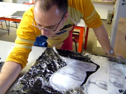
I also intend to try and finish at least one of the scary self portrait images I started. I've included one of these in progress on the left. The photos were painted over with thick black gesso, before cling film was applied to the wet surface and marks were forced into it with the wrong end of a brush. When this dried, it created a really cool textural quality. I then dry brushed white over this, picking up the textural highlights of the black gesso. White squares of various sizes were then sponged over this (as a reference to my super-organised, retentive personality), before I dribbled PVA glue over the image to create an almost maze like series of compartments. This was in part a reference to an earlier sketchbook page, where I had used the glue to compartmentalise elements of a picture, almost like the drawers of memory in the sub-conscious. Again the idea of hemming in parts of the picture relates to my love of order and structure. (Perhaps here lies a hidden link to my abstract collage work of old, as most of that was to do with structure and balance and a sense of order from the random). I hated the image initially, seeing it as far too much of a departure from myself and what makes up my personality. However, I re-visited the image at the same time as working on the bears and began to add little shocks of colour here and there, over-working the photographic imagery. It started to take on a much more comfortable feel, so the intention will be to continue to work with shocking colour in the pockets created by the maze-like border of PVA. I may also add some typographic references to mapping, perhaps adding the names of countries or river systems, as I believe the piece has a map-like quality. Perhaps it is a map of my artistic psyche? Hmmm that's a bit deep.....


Monday, 16 July 2007

Mary had a little lamb, she also had a bear...

So the bear images began to develop. I started by using reference from images found online. These reference images were physically cut and stuck to begin with, before I realised that using my artistic license could work just as effectively. These initial experiments with paint, colour and style were fairly small scale (A5-A4 size) and focussed on achieving a workable identikit effect, mixing the teddy features to create the best effect. They also served to experiment with paint use to re-create the fluffy qualities of the bears. I was keen to utilise a fairly loose approach to the painting, as traditionally my style has always been quite tight and precise. Again the idea being to stretch me artistically and take my work in new and unfamiliar directions. At the same time as doing all this paint and compositional experimentation, I remembered the work of the Chapman Brothers which I had seen a couple of years ago at the Tate Britain as part of the Turner Prize. One of their pieces had caused a rather exciting uproar, as they had quite cheekily defaced a series of important etchings by the Spanish artist Goya. I remember thinking these were great at the time because they injected such humour into these fairly stiff images of war and death by goya. I enjoyed the playfulness with which they were poking a bit of fun at the po-faced-ness of the art establishment, paying thousands of pounds for the Goya prints, only to paint clown faces all over them. Taking this on board I started to experiment with overworking photographic imagery, going back to my original intentions to work with photographic material.

Sunday, 24 June 2007

toy story

... and I settled on toys, specifically teddy bears. I gave dolls a try during the developmental stages and they just looked a bit too much like the scary dolls out of those Chucky films - not the sort of vision I had in mind! Bears struck a chord with me... they had a sense of the innocence of a child. Their faces perma-frozen in a state of cute bewilderment. The fluffiness of them added to their cuteness and gave them a sense of fragility and softness. They were ideal vessels to represent my daughter. I had ben keen not to go down a completely figurative route again. I'd already put myself in the picture through the self portrait work earlier in the course and felt uncomfortable using my daughter's image in that way. Using the bears as a symbol allowed me to suggest aspects of her essence instead. The idea then, was becoming clearer but still didn't quite have the edge I needed to give it that little bit of quirky sparkle. Which is where the Identikit came in. I started to carry out research on the internet. My original hope being maybe to construct the bears three dimensionally, somehow piecing together bits of bears to create the desired effect. I gave up on this fairly quickly as the practicalities would have resulted, I'm sure, in creatures much like those created by the twisted Sid in Toy Story! I was then keen to use original Identikit elements from the 1960's and 70's to construct my own Bear identikit set. Sadly (because I thought the idea was cool!), this also met an unresolved end, when it proved impossible to get hold of the original identikit sets. I had been doing some paintings with my GCSE students in the style of the German Expressionist painters, and resolved to continue this expressive, painterly approach, utilising elements of identikit facial re-construction.
The idea of juxtaposing the soft and cute teddies with the harsh realities of criminal life appealed to me. The criminality representative of one's potential at birth. I was trying to say something about the harshness of the world into which my daughter was being born. Of course, great things happen every day, but these are peppered by the horrific things which seem to dominate the news. Giving the bears this criminal undercurrent spoke to me of this ever present evil which surrounds us. Also of the potential we all have as children. To follow one path (the bear) and become moral and just citizens, or to react against it and become the criminal undercurrent.

Thursday, 21 June 2007

Teddy bears picnic

So, since my last post I've become a Daddy and have been working my socks off to produce work for the end of course exhibition at Modern Art Oxford. The tack I had initially taken in response to Faisal Abdu' Allah's work, using photographic imagery as a basis (See attached images) has changed fairly radically.

The original intention was to link to Faisal's central theme of identity and create a number of photo / mixed media pieces in response to my impending fatherhood. This work progressed quite nicely, with some successful experimental trials transferring photographic imagery and working with paint and ink in, what for me, were new and exciting ways. I was really enjoying the making process and producing work which I thought was quite cool.

It was only upon going through the first critique process around February time (incidentally coinciding with the birth of my daughter) that I started to realise that, whilst the imagery was cool and I was having great fun making it, it's meaning was fairly superficial. It no longer represented what fatherhood was all about. The initial imagery, which had been squarely centered on me and my feelings now seemed irrelevant. Fatherhood now seemed to focus more my daughter and the joy she had brought and the potential which awaited her as she entered the world. The photographic approach also seemed somehow crude and dark, unlike my usual art and indeed my personality. Infact, some of this photographic work became so dark I was in fear of showing it to my wife lest she think I'd been body snatched!!

So, I began searching for an alternative take on the idea. I was still keen to pursue the angle of fatherhood and what it meant to me but needed a new angle, a new edge...

Tuesday, 16 January 2007

All Virgo's are mad


So the message posted yesterday as a test did what it should, which is jolly exciting! Being new to this whole blogging thing, I was pleased to see my efforts of clicking through boxes (fairly randomly I have to admit!), looked quite smart, with pictures and everything! The illustration on the left, by way of introduction today, was based on a Holiday a couple of years ago to the beautiful town of Lindos on the Greek Island of Rhodes. The cube structures were based heavily on the white cubed buildings surrounding the impressive Acropolis. The circular elements represent the glowing lights of the town as you look down from the hill leading up to the Acropolis. The grey shape in the very background represents the turreted profile of the Acropolis itself. The illustration on the right shows one of the famous Lindos Donkeys, which act a bit like a 4 legged taxi taking tourists up and down to the Acropolis. My illustration style has remained pretty much unchanged over the last 8 to 10 years, characterised by the one big eye (usually with a dark circle round it), one small eye approach to creating character. Bright colour has always been a key part of my work, so the illustrations employ cheerful, usually colour-pencil blended tones. Line is another important quality in my illustration work. I like to play around with quality of line and the use of continuous line. Shapes and features are often irregular, angular and a bit disjointed. I'm not consciously influenced by existing illustrations, although I like Quentin Blake's work and the work of E.H Shepherd. The nearest link I guess could be Picasso, with my characters having a slightly Guernica-esque quality to them, probably influenced through use of the image and Picasso's style through this image within my teaching. The illustration work allows the colourful, more child-like aspects of my artistic temperament to have a bit of freedom, a contrast to the ordered, structured and serious concerns of my mixed media work. Anyrate, recent work, influenced by the contemporary practice course, has taken new and exciting turns. More of which another time...

Monday, 15 January 2007

So what's it all about, Alfie


So, I finally got firefox sorted on my computer out and now this blog malarky can get off the ground. I'm currently undergoing the first year of what will hopefully become an M.A in education. This year the focus is on contemporary art in education and on re-engaging in my own art practice. Handed in my first module of work at the weekend, which was a big weight off, and can now start to focus on developing my art practice in new and exciting ways. There's an example on the left here of some of my older work, predominately collage / mixed media based with influences including Asian / Indian / Arabic culture (I'm intrigued by the graphic qualities of the typography from these countries). The course so far has been a big creative re-engagement in my own work and it's been great to explore different ways of working. More another time, this is a bit of a test of how this whole blogging thing works.