The communication series started with a series of images in my sketchbook, playing around with how the layout of the text was going to work. I created simple word documents of text overlaid at different sizes, sticking this into my sketchbook. I then overworked the image with
gesso (to add texture), coloured inks and watered down acrylic paint. When the page was dry I then overlaid thick
PVA glue in simple, geometric and linear patterns. This dried clear over about 24 hours and left a cool, shiny trail across he work. The final stage in the preliminary images was to over-work elements of the now knocked-back text with
biro. The idea for this came from the original
Helvetica programme and the idea that the font was designed to be so highly communicative. I was keen to mess with this preconception of the font and to treat it in a completely opposite way, decomposing the message and altering its legibility. This was also in keeping with the idea of how technology removes elements of meaning and truth from modern communication. I was pleased with the results,
although they lacked a little impact due to the brown paper backing (colours were deadened a little as a result). I then experimented further, playing around with the words I was using and how the text could work to relate more obviously to technology. I thought about syntax errors received as a child on my commodore 64 and the frustrations experienced as computers failed to deliver precisely what I was after. This led to the use of
CTRL, ALT, DEL, and run-stop restore as themes within the pieces. I experimented with using text that had a
pixelised quality, using squared pages in my sketchbook to construct old-school computer style text. I used a water soluble pen, which then had ink and glue dribbled over it. As a result, the wet medium mixed with the inks and created a really cool blurry effect, with colours within the pens
separating out in a random way. Again this was effective in disguising the message. The experiments had once again galvanised me into action and I felt able to start experimenting on a larger scale. The first canvas was ready to be tackled...


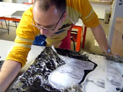
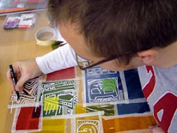
 Here are a few more of the original sketchbook tests for the communication series. What started as a very rough sketch (top left) became gradually more complex and involved. The second image (top right) was where the final images were crystalised in my head. This image showed me how the colours could work in tandem with the text and also how the text could be broken up and altered to play with the legibility of the message. The remaining predominantly black and brown images were heavily influenced by the graffiti style of writing seen in the 'street sketchbook'. The addition of tin foil and gesso textures in the final pieces came from the yellow and purple abstracts I'd produced in my sketchbook straight after I had completed the teddy bear series. Work in progress for the communication series in the next post...